Ongoing · Flutter Entertainment / GST
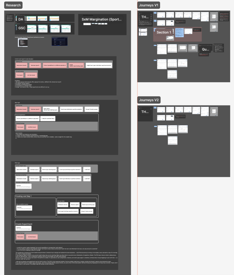
Detailed screens are not shared as this is an internal tool. Images show the scale of output across each initiative.
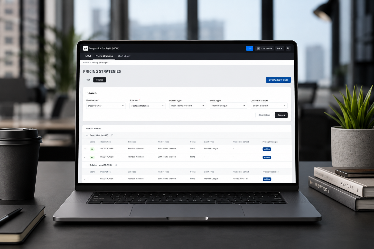
In sports betting, margination is how a bookmaker builds their edge into the odds. Every market — a football match, a tennis set, a horse race — has a margin applied to it, and that margin affects what price a customer sees. MCUI is the internal tool traders use to manage, configure, and control those margins across thousands of markets.
It's a complex tool. Not complex in a way that's easy to explain in a sentence, but complex in the way that only becomes clear when you sit with the people who use it every day. I joined the project early, when the skeleton of the platform had just been built. What followed was a series of initiatives, each adding a layer of capability — and each bringing its own set of design challenges.
The first thing I did when I joined was run a usability test.
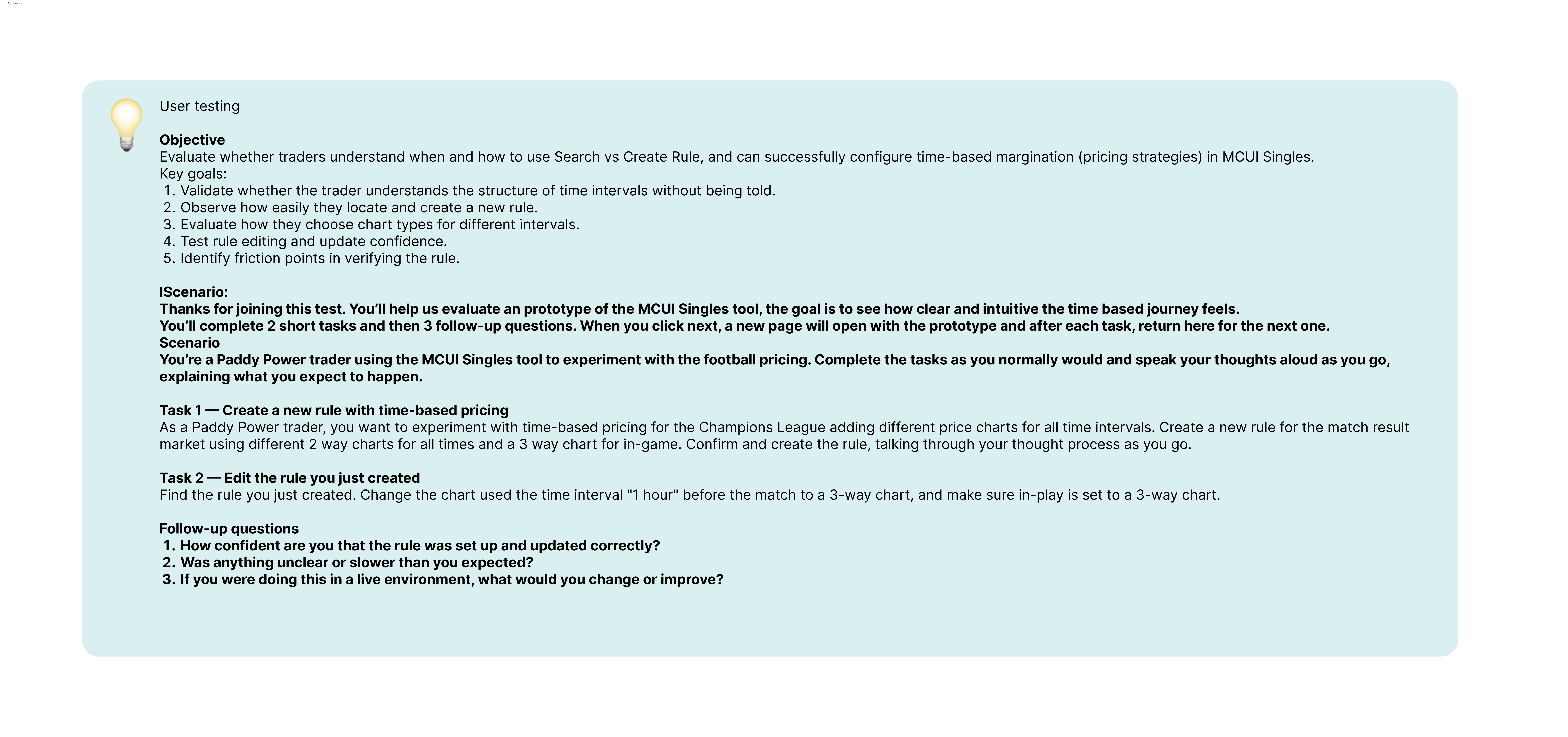
Time-based margination had just been shipped — a feature that lets traders schedule margin changes automatically over the course of an event. The engineering was done, but nobody had yet sat down with real traders and watched them use it.
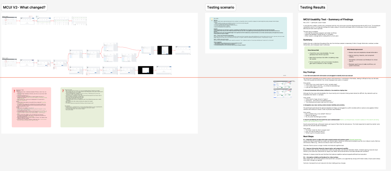
I designed a testing scenario that reflected actual working conditions: traders under time pressure, managing multiple markets, making decisions fast. The sessions surfaced a set of usability issues that hadn't been visible from the inside — places where the interface assumed knowledge traders didn't have, or where the flow broke down in ways that only became obvious in practice.
The findings shaped the next round of work. It also established a pattern: test with users, not just stakeholders.

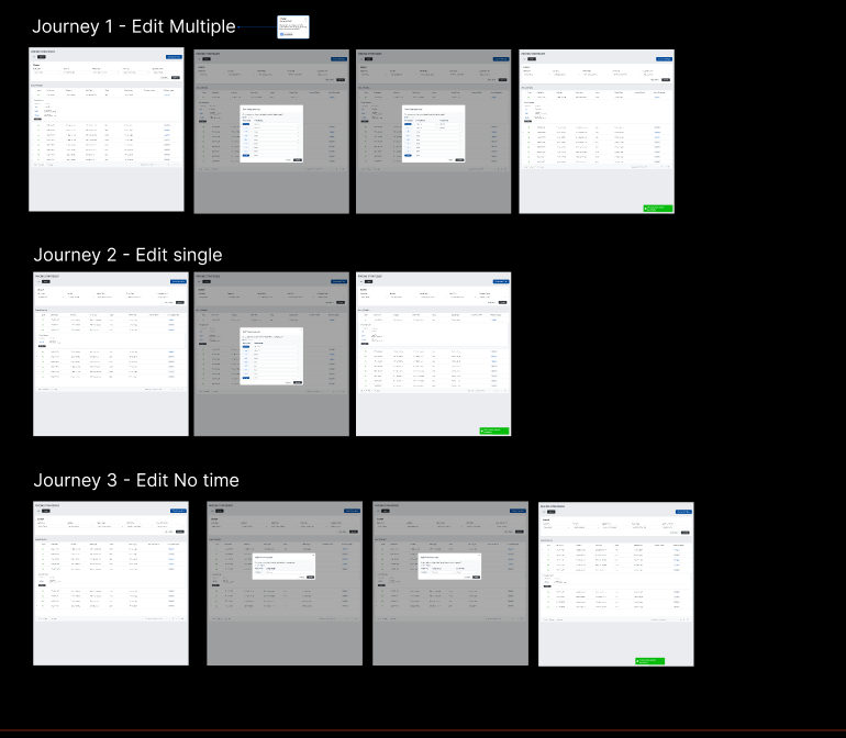
Once traders had created margin rules, they had no way to change them without starting over. That sounds like a small gap, but in practice it created real friction — traders were working around the tool rather than with it.
Adding edit and delete sounds simple. The UX challenge is that margin rules can have downstream effects: a rule that's been applied to live markets can't simply be removed without consequences. The design needed to handle those states clearly — letting traders make changes confidently while making the impact of those changes visible before they commit.
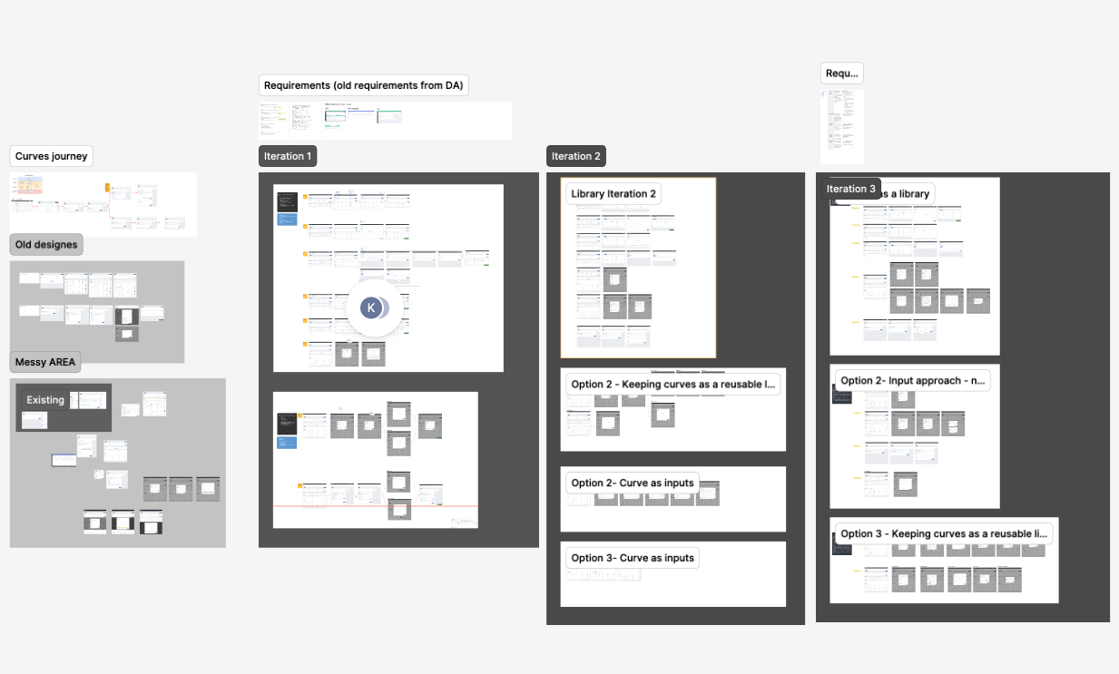
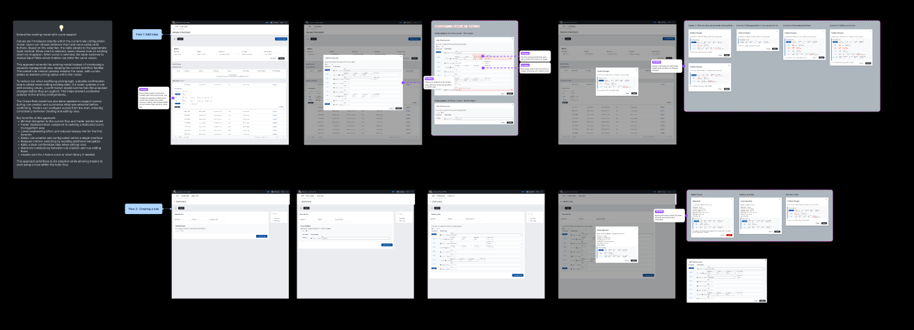
Curves was the most design-intensive initiative on the project.
In margination, a curve defines how a margin changes over time — not just "apply X% from 3pm", but a dynamic shape that can rise, flatten, spike, or taper based on how a market is behaving. It's a concept that experienced traders understand intuitively but that's genuinely difficult to represent in a UI.
The challenge was making something abstract — a mathematical relationship between time and margin — feel concrete and controllable. Traders needed to be able to create and edit curves without needing to think in formulas. That meant finding the right visual representation, the right interaction model, and the right level of control to expose without overwhelming users who were new to the concept.
This involved multiple rounds of concept work, testing with traders, and close collaboration with engineering to understand what the data model could actually support.
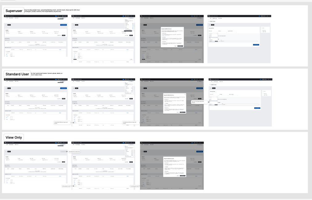
Not everyone using MCUI should be able to do everything in MCUI. Traders at different levels have different responsibilities, and some actions — particularly bulk changes or changes to live markets — carry significant risk if made by the wrong person.
Roles and permissions addressed that. The scope was relatively contained compared to Curves, but the importance was high: getting permissions wrong has direct consequences for data integrity and financial exposure. The design needed to make access levels legible to users without adding friction to everyday tasks.
The most recent initiative, and the most complex from a UX perspective.
Until this point, traders worked with markets one at a time or in simple lists. Groups introduced a layer above that — the ability to organise markets into sets and apply actions to many of them at once. That's not just a new feature, it's a shift in how traders think about and navigate the tool.
The mental model challenge is significant: traders who've learned the tool one way now need to understand a new organisational layer that changes what everything else means. The design had to introduce that shift without breaking existing workflows or creating confusion for users who don't need groups at all.
Bulk actions compound the complexity. When you apply a change to a group of markets — some live, some scheduled, some with conflicting rules — the outcomes are varied and the error states are non-trivial. Communicating what happened, what succeeded, and what needs attention became as important as the action itself.
As MCUI grew, so did the need to understand how it was actually being used.
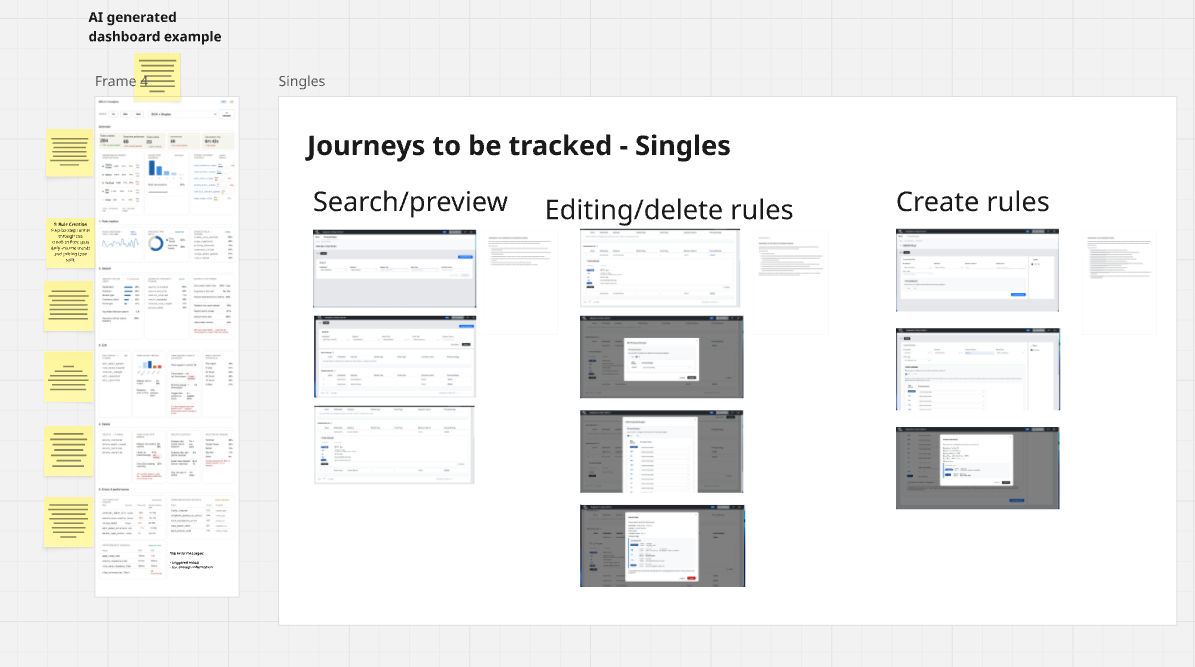
I worked with the data team to instrument the tool with usage tracking, feeding into a dashboard in Databricks. That dashboard gives the team visibility into which features are being used, where traders are spending time, and where they're dropping off — the kind of signal that's hard to get from user interviews alone.
I also added a feedback mechanism directly inside the tool: a button that surfaces when new features or updates are released, giving traders a low-friction way to flag issues or share reactions in context. It's a small addition, but it closed a loop that previously didn't exist — the team now hears from users without having to go looking for them.